Getting Itinerary Flow — V1 → V2The V1 flow used a 6-step wizard to collect trip preferences before generating an itinerary. Six structural problems were identified — primarily around step count, question sequencing, and the absence of output preview. V2 explored two directions: a condensed 5-step wizard and a single smart form. Both removed the highest-friction steps and added a generation moment with a sign-in gate as the conversion point. 6 → 2
Steps reduced: 6-step wizard condensed to 2 viable directions
2
Steps removed: Accommodation (premature) and Name your itinerary (backward)
+1
New phase added: generation animation + sign-in gate after the form
V1 — Annotated 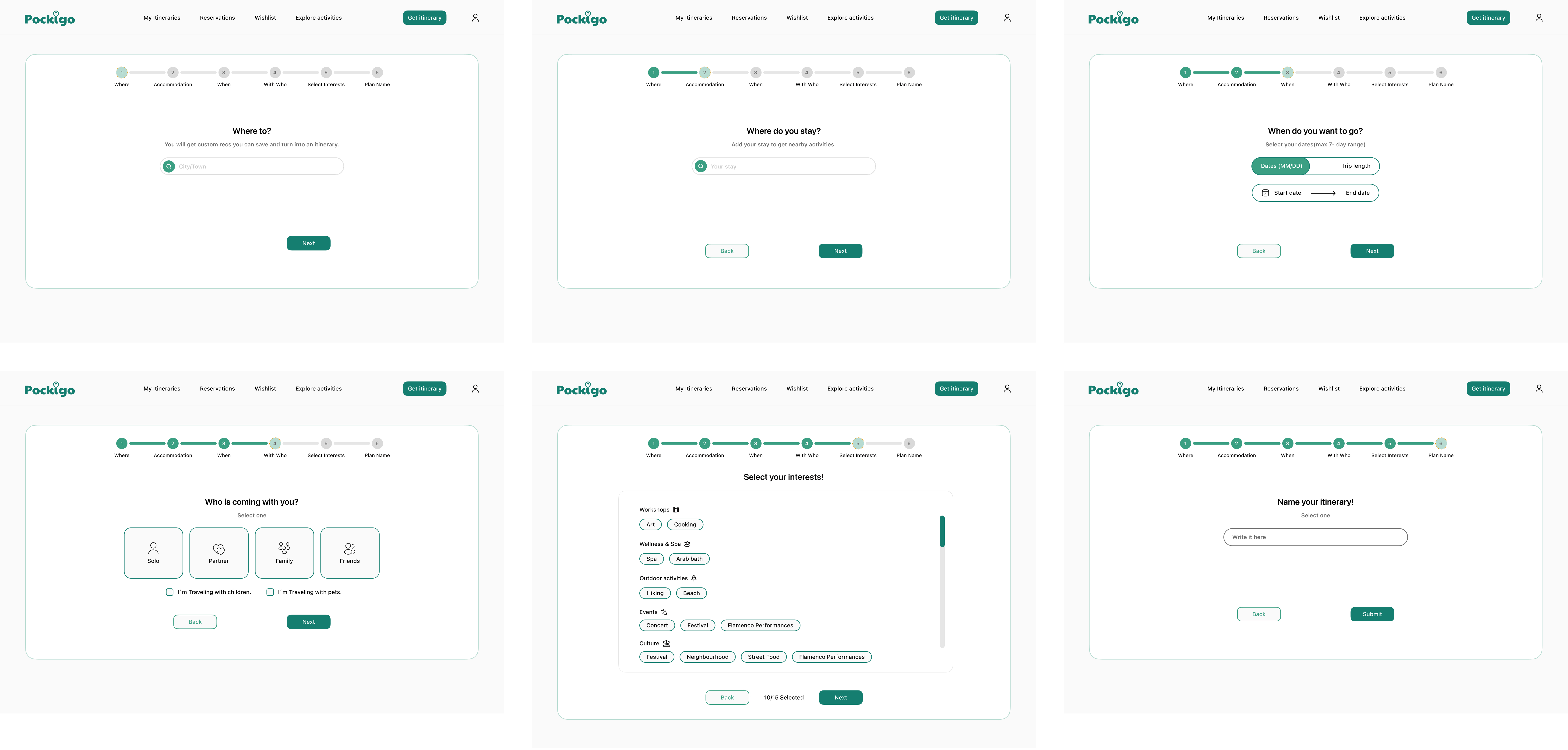 1
2
3
4
5
6
1
2
3
4
5
6
Problems & decisions 01
Flow architecture
Six steps signals too much effort before the user has committed The progress bar shows all six step labels — Where, Accommodation, When, With Who, Select Interests, Plan Name — before the user has typed a single character. Seeing the full length of a form upfront increases perceived effort and is a documented cause of early abandonment. For a product trying to demonstrate speed ("built in minutes"), asking for six rounds of input before generating anything contradicts the core value proposition.
Decision in V2
Two directions were explored: a 5-step wizard that removes the two lowest-value steps (Accommodation, Name), and a single smart form that presents all questions on one screen grouped into logical clusters. Both reduce perceived effort. The wizard direction retains the step-by-step focus mode for users who prefer guided input; the single form direction bets on speed and user autonomy. The progress indicator in V2 shows only the current step number, not the full step list. 02
Screen design
Each step is nearly empty — form feels unfinished Every V1 step uses the same layout: a large centered card, one headline, one or two inputs, and a Next button at the bottom. The white space is not intentional breathing room — it reads as unfinished. There is no visual weight, no brand texture, and no sense that the user is building something valuable. A user mid-flow has no context about what the output will look like or why any given question matters.
Decision in V2
In the wizard direction, each step uses the full viewport with a sidebar map preview that updates to show the destination. The form area is denser — questions are contextualised with a short rationale ("helps us route your day"). In the single form direction, the form and a live itinerary preview panel sit side by side, so the user can see stops appearing as they fill in preferences. Both directions use the brand's teal and Poppins display type to signal product quality. 03
Question sequencing
Accommodation is premature as a dedicated step Step 2 asks "Where do you stay?" with the note "Add your stay to get nearby activities." This is an optimisation — knowing the hotel means the itinerary can bias toward nearby stops — but it is not a prerequisite for generating a plan. Placing it second, before dates and travel party, makes it feel mandatory and gives it equal weight to core inputs. Users who haven't booked accommodation yet face a minor but real friction point.
Decision in V2
Accommodation is removed from the planning flow. It can be added later as an optional enrichment step on the generated itinerary page ("Add your hotel to optimise routing"). This keeps the core flow to the minimum viable inputs and allows users without accommodation booked to complete planning without encountering a field they cannot yet fill. 04
Interaction design
Companion selection mixes two incompatible interaction patterns Step 4 uses icon cards (visually styled as a single-select group) for Solo / Partner / Family / Friends, then adds two checkboxes immediately below: "I'm travelling with children" and "I'm travelling with pets." The icon cards imply a radio-select mechanic; the checkboxes imply a multi-select mechanic. Both live on the same screen under the same question. Users could reasonably interpret "Family" + "I'm travelling with children" as redundant, or wonder whether selecting "Solo" locks out the checkboxes.
Decision in V2
Companion type and special requirements are merged into a single coherent model. In the wizard, "Who's coming?" uses a single-select tile row for travel party size/type, and a secondary row for modifiers (kids, accessibility needs) appears only when relevant (e.g. selecting "Family" surfaces the children modifier). This eliminates the dual-pattern ambiguity and reduces visual noise on the screen. 05
Content taxonomy
Interests UI has inconsistent categories and duplicate items The interests step organises tags under five categories: Workshops, Wellness & Spa, Outdoor activities, Events, and Culture. "Flamenco Performances" appears as a tag under both Events and Culture. The categories vary widely in specificity — "Culture" is extremely broad while "Wellness & Spa" is narrow. "10/15 Selected" as a progress indicator suggests the user must choose a minimum number of interests, but the rationale for that threshold is unexplained. A deeper issue: granularity does not equal personalisation quality. When users are offered 15+ options, they tend to select many — the "10/15 Selected" prompt actively encourages this. A user who picks 10 out of 15 tags produces almost no signal: the system cannot distinguish their preferences from a user who picked 12 different tags. More options collapsed into a large selection is equivalent to no selection at all. Additionally, several tags were destination-specific and meaningless elsewhere: "Arab bath" only exists in Andalusia; "Beach" is irrelevant in landlocked Granada.
Decision in V2
The category taxonomy is replaced with two high-signal inputs. First, pace (Slow & easy / Balanced / See it all) — the number of stops per day turned out to be the single most predictive input for itinerary quality, more so than any activity subcategory. Second, top-level interest areas (Food & tapas, Culture & history, Nature & views, Nightlife, Coffee & cafés, Markets, Architecture, Local life) — eight destination-neutral categories that apply across all cities and produce a clear weighting signal without requiring the user to know what subcategories exist in a city they haven't visited yet. Dietary and access needs are collected as a separate optional question, not mixed into the interests taxonomy. 06
Conversion design
"Name your itinerary" is backward friction at the point of highest drop-off The final step before Submit asks users to write a name for their itinerary. This is the wrong moment for this question: naming implies ownership, and ownership implies the user has already seen what they're getting. Asking for a name before generation reverses this. It also places an open-ended, effort-requiring field (free text) immediately before the primary conversion action — exactly where a user who was already hesitating is most likely to abandon.
Decision in V2
The naming step is removed entirely from the flow. After generation, the itinerary is automatically titled by destination and dates (e.g. "Granada · 17–19 Apr"). Users can rename it from the itinerary header after they've seen the plan. The conversion event in V2 is the sign-in gate that appears over the generated itinerary — "Sign in to open your plan" — which frames account creation as unlocking something already built, not as a prerequisite for building it. V2 — Two directions explored
A
Wizard — guided, step by step
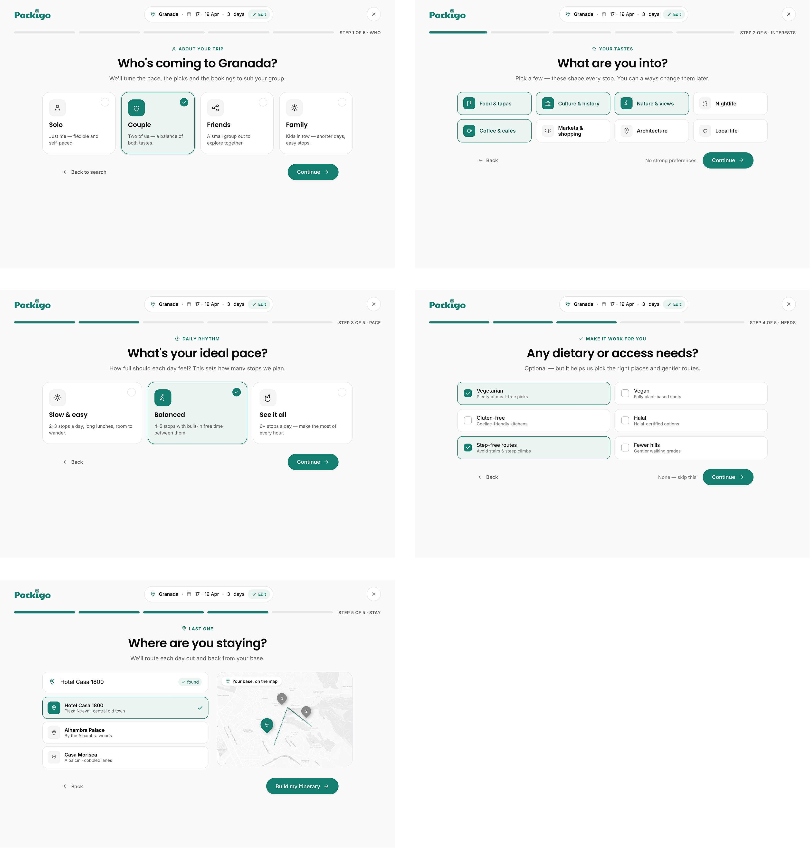
5 focused steps, one question per screen. Map preview updates live
alongside the form. Best for users who want guidance and prefer
committing to each answer before moving on.
B
Single smart form — fast, all at once
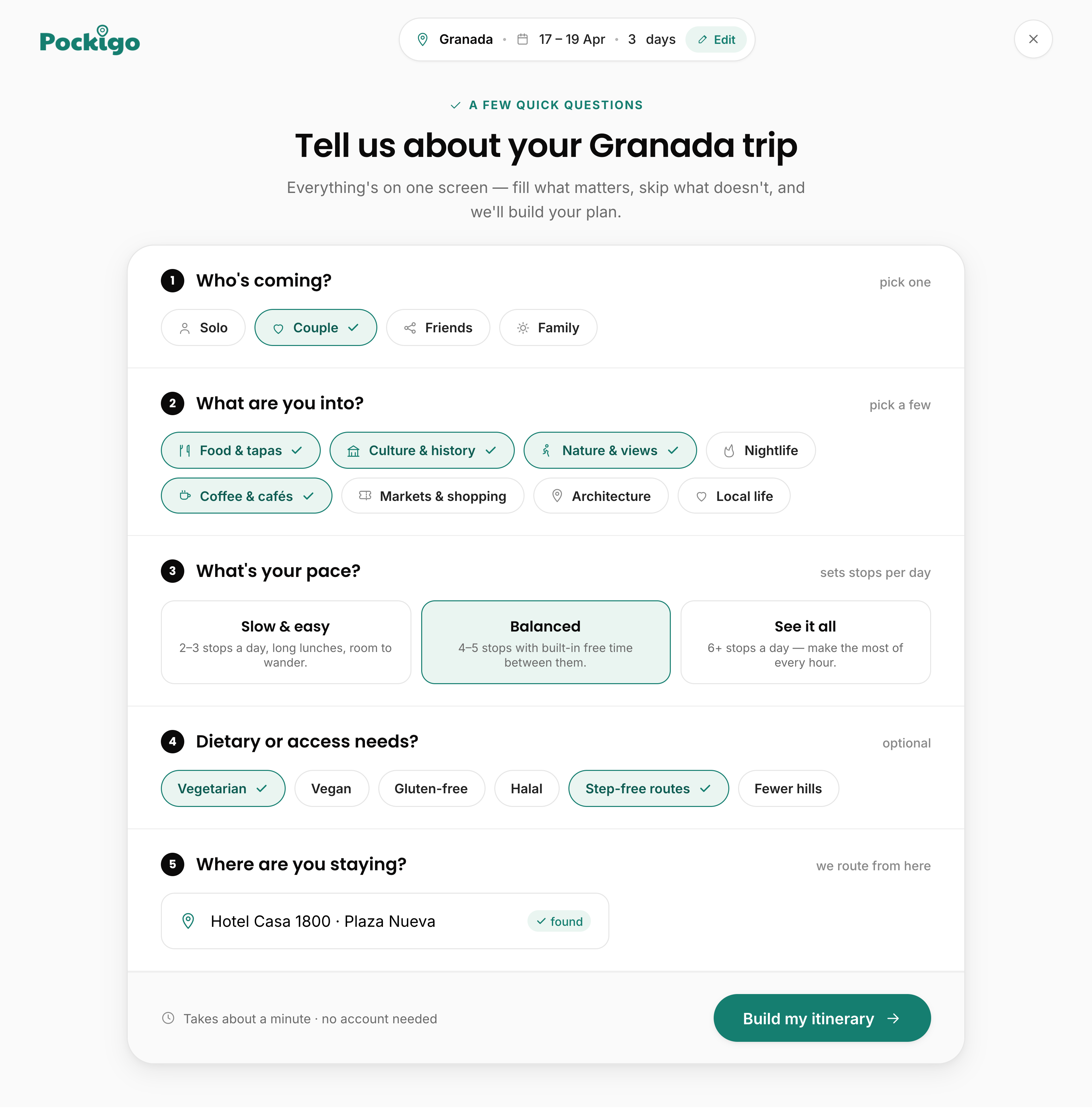
All questions on one screen with a live itinerary preview panel.
Optimised for return users and confident planners who want to scan,
fill and submit in one pass.
Direction chosen Direction B — Single smart form was chosen. After reviewing both directions, the single smart form (Direction B) was taken forward for the following reasons:
|