Itinerary Page — V1 → V2The V1 itinerary page got the structure right — a timeline with a map, day tabs, and stop cards — but revealed six execution problems in card content, pricing logic, transit information density, and feature gating. V2 addresses each without changing the core layout. 6
Issues identified across cards, pricing, transit info, and feature gating
2
Elements removed: accommodation timeline stops and app-download direction prompt
3
CTA states introduced: Book ticket / Reserve table / Walk-in (free) — replacing a single "Book now"
Before & After V1 — Before
 1
2
3
4
5
6
1
2
3
4
5
6
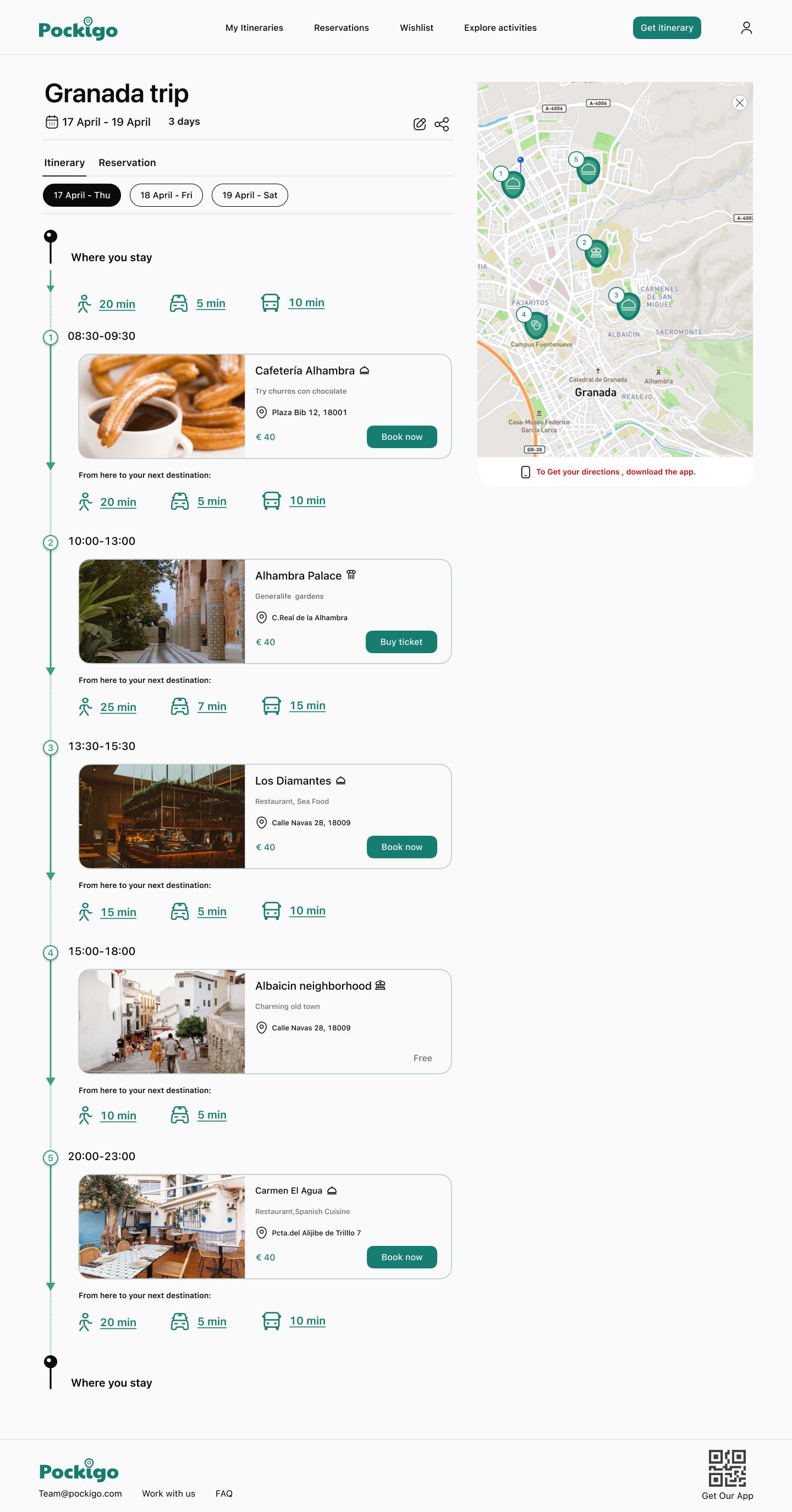
V1 — Single layout, uniform "Book now" CTAs, transit info between every stop
V2 — After
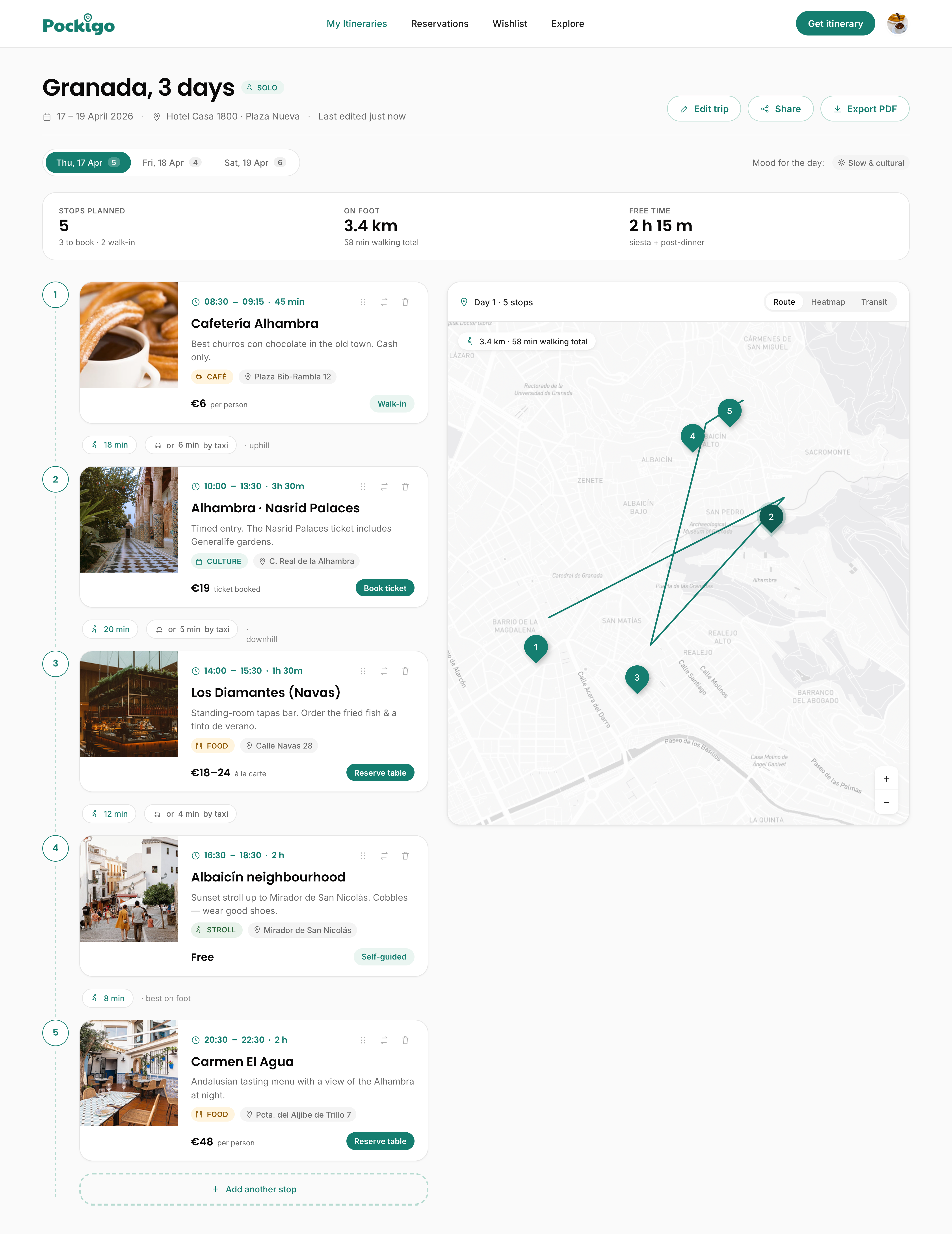
V2 — Contextual CTAs, inline alternatives, tighter transit info
Problems & decisions 01
Information architecture
"Where you stay" as a timeline stop is misleading The accommodation location appears twice as a pinned stop: once at the top of the timeline and once at the bottom. This frames the hotel as a scheduled activity alongside cafés and palaces, implying a time block and travel segment that doesn't exist. It also repeats the accommodation-as-prerequisite problem from the planning flow — users who haven't booked yet see a prominent empty slot at the start and end of every day.
Decision in V2
Accommodation is removed from the day timeline entirely. The itinerary starts and ends at the first and last stop of the day. Hotel proximity is used silently to optimise routing, but it is not surfaced as a visual timeline element. An optional "Add your hotel" nudge appears in a sidebar panel for users who want to activate this optimisation — it is not blocking or prominent. 02
Map design
Map shows pins with no routing or visual hierarchy The V1 map panel displays a static set of numbered pins with no connecting route, no visual distinction between stop types, and no indication of walking order. A user looking at the map cannot determine the sequence of stops, how far apart they are, or what the day looks like spatially. The map sits alongside the timeline as a decorative element rather than a functional navigation aid. Directions are further blocked behind an app download prompt (see #04).
Decision in V2
The map in V2 draws the full routed walking path between stops as a polyline, colour-coded by day. Numbered pins match the timeline cards exactly, so the user can switch between list and map views without losing context. Clicking a pin opens the stop card inline — no page navigation. Walking distances are shown on each route segment. For legs over 20 minutes, an alternative-mode prompt appears directly on the map connector, not as a separate directions screen. 03
Visual density
Transit info between every stop creates visual noise Walking / car / bus travel times are displayed between each stop in three separate rows, each with an icon. On a 5-stop day this produces 4 transit blocks — a significant portion of the screen real estate. The repeated 20min / 5min / 10min values appear to be placeholders (identical across multiple stops), which further undermines their credibility. Most users will walk between stops in a well-designed itinerary; showing car and bus options between every consecutive stop adds noise without adding value for the majority case.
Decision in V2
Transit information is condensed to a single inline connector between stops showing walking time only by default, with a tap-to-expand for other modes. The connector also shows distance in metres for short legs (under 800m) where walking is clearly the right choice. Car and bus times are shown only when the walking time exceeds 20 minutes, surfacing alternatives only when they are genuinely relevant. Each time is calculated from real coordinates, not placeholder values. 04
Feature gating
Directions gated behind app download on the map A red prompt sits below the map: "To Get your directions, download the app." This gates turn-by-turn directions behind an app install — a significant friction ask at a moment when the user may be actively planning a trip. On the web product, this sends the user off-platform to an app store before they've completed their primary task (reviewing and booking the itinerary). It also implies the web version is a lower-tier product, which undermines the web experience.
Decision in V2
Directions on the web open directly in Google Maps or Apple Maps via a standard deep link — no app install required. The Pockigo app is promoted as an optional enhancement ("Get offline maps in the app") rather than a gate. The map component in V2 shows the full routed path between stops as a visual reference, with numbered pins matching the timeline. Clicking a pin opens the stop card inline without leaving the page. 05
CTA consistency
Free stops lack a CTA while paid stops have one — no clear pattern Albaicín neighbourhood correctly shows "Free" with no action button. But the implicit pattern this creates — paid stops have buttons, free stops don't — means the user cannot predict what will happen when they interact with any given card. Some free stops might have a useful action (save to wishlist, share location, open in maps) that is absent because the button slot is reserved for booking. The V1 card has no secondary action layer at all.
Decision in V2
Every stop card has a primary action, regardless of cost. For free stops, the primary action is "Show on map" or "Self-guided" depending on context. A secondary action row appears on expanded cards: "Save to wishlist," "Swap this stop," and "See alternatives." This ensures every card is interactive and the button slot is never empty, making the card pattern predictable and consistent across all stop types. 06
Footer
App download QR code in footer is out of context A QR code and "Get Our App" prompt appears in the footer of the itinerary page. The itinerary page is a high-intent, task-focused screen — the user is reviewing stops and preparing to book. A QR code at this point interrupts the task without providing value relevant to what the user is trying to do. QR codes in footers are also a pattern associated with early-stage products that haven't decided where to put the app promotion.
Decision in V2
The app promotion is removed from the itinerary footer entirely. App download is promoted at two contextually relevant moments: after booking a stop ("Get your ticket in the app"), and on the post-itinerary confirmation screen ("Save your plan offline"). Both placements offer a genuine reason to install rather than a generic push at the bottom of the page. 07
Itinerary header
V1 header gave no sense of the day at a glance The V1 itinerary header showed the destination name and date — nothing more. A user landing on the page had no immediate way to understand the character of their day: how many stops were planned, how much walking was involved, how much unstructured time was built in, or what the overall mood of the itinerary was. All of that context required scrolling through every card, which defeats the purpose of a curated plan.
Decision in V2
Three additions were made to the itinerary header to surface the most useful context before the user reads a single card:
|