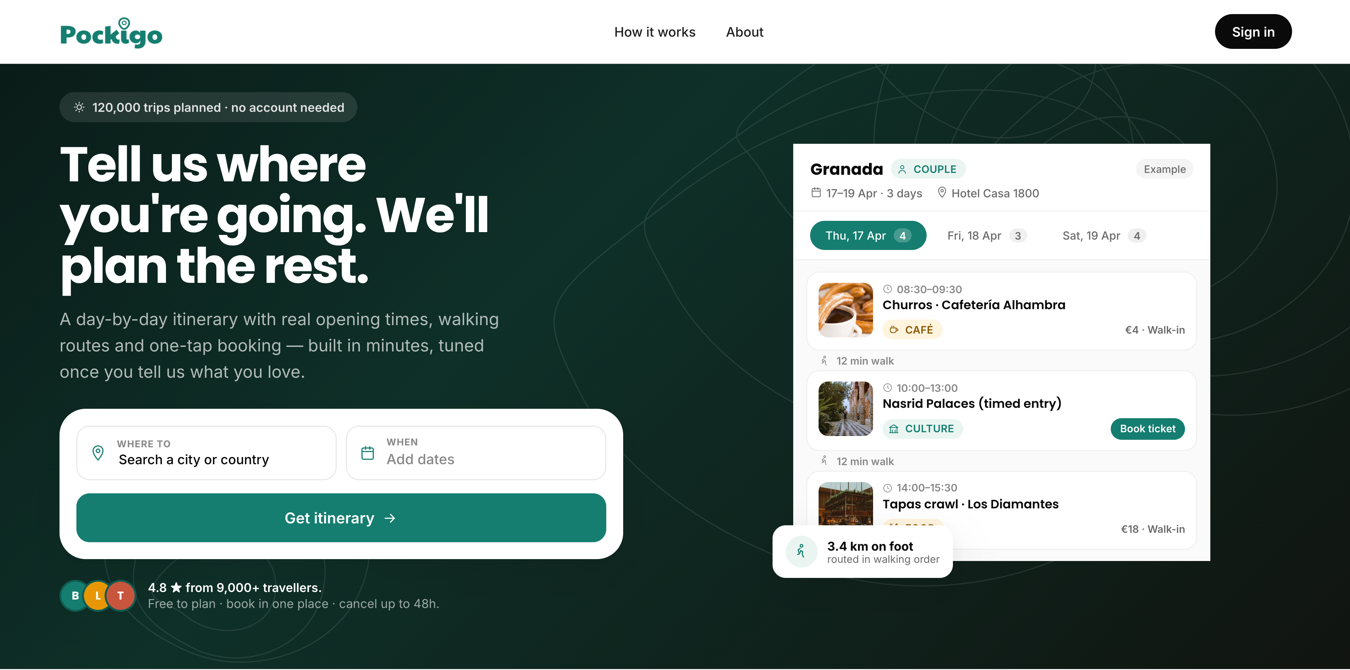
Pockigo
Pockigo helps independent travelers discover, organize, and personalize their trips — without relying on traditional tours.
02 — What is Pockigo?
Pockigo is a travel planning product built for independent travelers who want a ready-to-use itinerary without the research overhead.
This case study focuses on the desktop website experience — from discovery to a personalized itinerary.
Designing the end-to-end planning experience, from landing page to a personalized itinerary.
Covered separately as its own case study.
03 — Overview
The project began as a team effort, from research through to the first high-fidelity designs. I then led the redesign independently, taking the V1 screens through a full second pass across the homepage, planning flow, and itinerary page, resulting in the V2 designs and clickable prototype documented here.
04 — Business Needs & Design Goals
The project started with five clear business needs. Each was paired with a design goal to keep decisions anchored in real user value.
| Business needs | Design goals |
|---|---|
| Provide a personalized itinerary based on destination, date, trip duration, and the user's interests. | Filters that narrow results by destination, dates, and interests, so the itinerary feels curated, not overwhelming. |
| Allow the user to modify the itinerary with ease. | Inline editing that lets users swap, remove, or reorder activities without leaving the itinerary view. |
| Offer an interactive map view. | A map that stays in sync with the itinerary; tapping a pin shows activity details without a full page transition. |
| Allow the user to share the itinerary with their travel buddy. | A one-tap share flow that sends a clean, readable itinerary — no account required for the travel buddy to view it. |
| Users can access their past, active, and upcoming plans at any time. | A dashboard that separates past, active, and upcoming trips at a glance — no digging or searching required. |
05 — Design Method
The project followed the double diamond — diverging to understand the problem space, then converging on the right solution.
Discover
User interviews
Affinity diagram
Competitive analysis
Define
Persona
Card sorting
IA + site map
Develop
Wireframes
Usability test
Moodboard
Deliver
UI kit
Hi-fi screens
Final prototype
06 — Discover
Research began with user interviews to surface real behaviors and frustrations, followed by competitive and comparative analysis to map the existing landscape and identify opportunities.
User Interviews
We recruited independent travelers who had planned at least one trip abroad in the past year. Sessions were semi-structured, focusing on their planning process, tools they use, and moments of confusion or frustration.
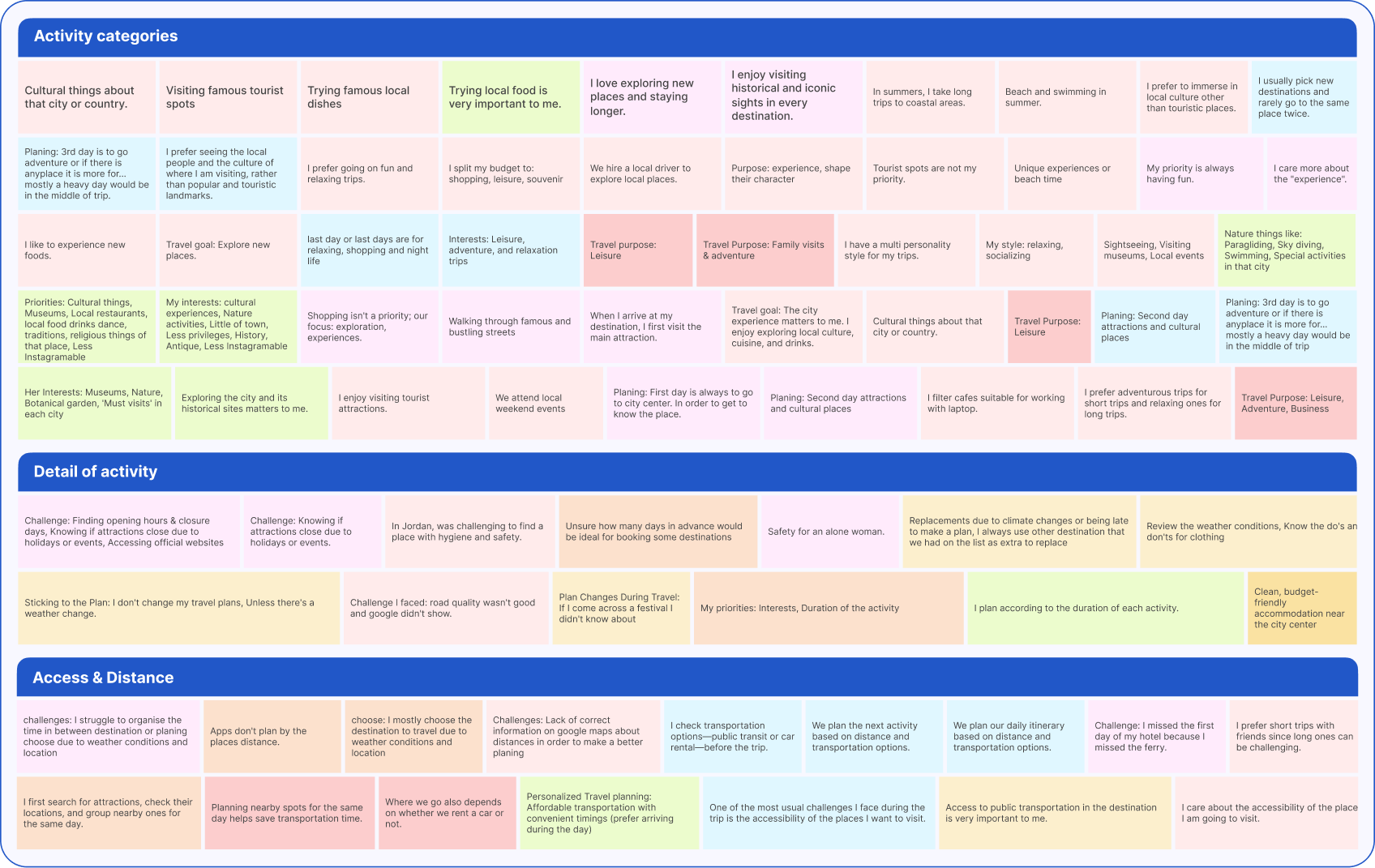
Common user needs and pain points
"I have tabs open for Google Maps, a travel blog, my notes app, and three booking sites — and I still feel like I'm missing something."
— Participant 3, solo traveler
Comparative Analysis
We examined some of the most popular travel planning platforms, compared their features side by side, and analyzed how closely they align with what we're building.
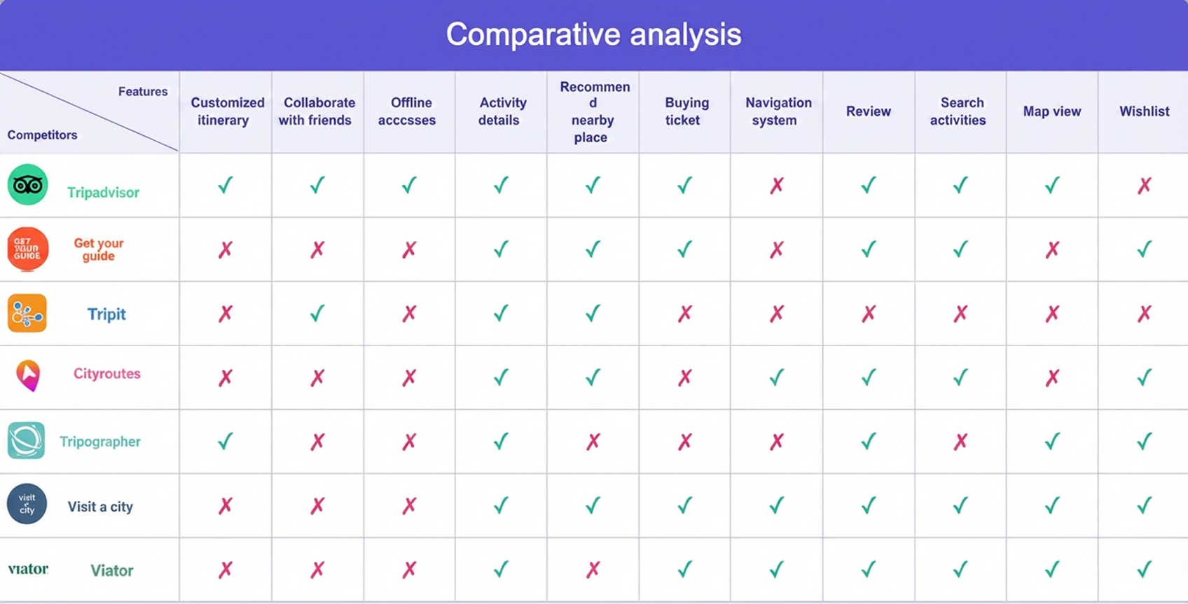
Competitive Analysis
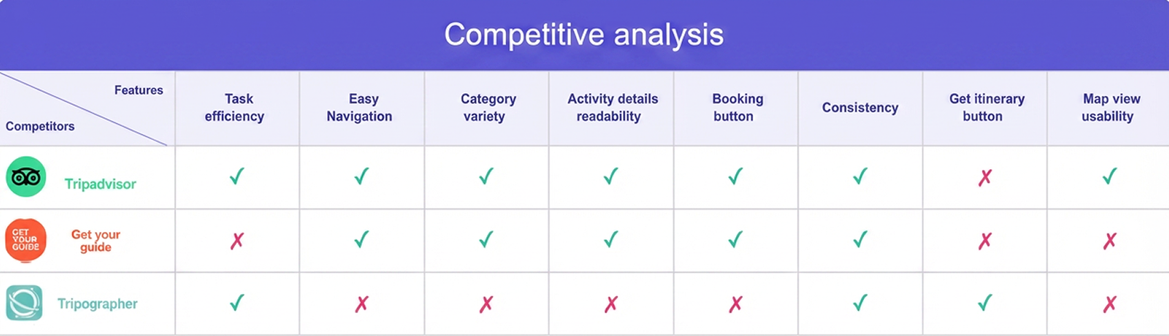
We identified Tripadvisor, GetYourGuide, and Tripographer as our main competitors and analyzed their weaknesses:
Key outcomes
Tripadvisor — Missing "Get Itinerary" button, limiting quick access to plans.
GetYourGuide — Low task efficiency and no direct itinerary access.
Tripographer — Poor navigation, limited category variety, and weak activity readability.
By studying these pain points, we ensured Pockigo avoids the same issues. We also drew from their strongest features to create a user flow that is intuitive, efficient, and easy to follow for our target audience.
07 — Define
With the research synthesized, we moved on to structuring who we're designing for, how content should be organized, and what the full site structure looks like.
User Persona
Based on our research, we defined a primary persona to keep design decisions grounded in real user needs throughout the project.
Information Architecture
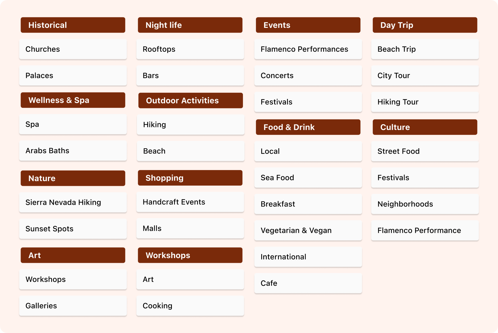
We developed the site's Information Architecture based on the research and competitive analysis we had done. However, we faced challenges when naming the categories — our goal was to make them clear and easy for users to understand.
To solve this, we conducted a card sorting exercise with 6 participants. Using activities in Granada as our reference, we used card sorting to identify and refine the most suitable category labels.
Site Map
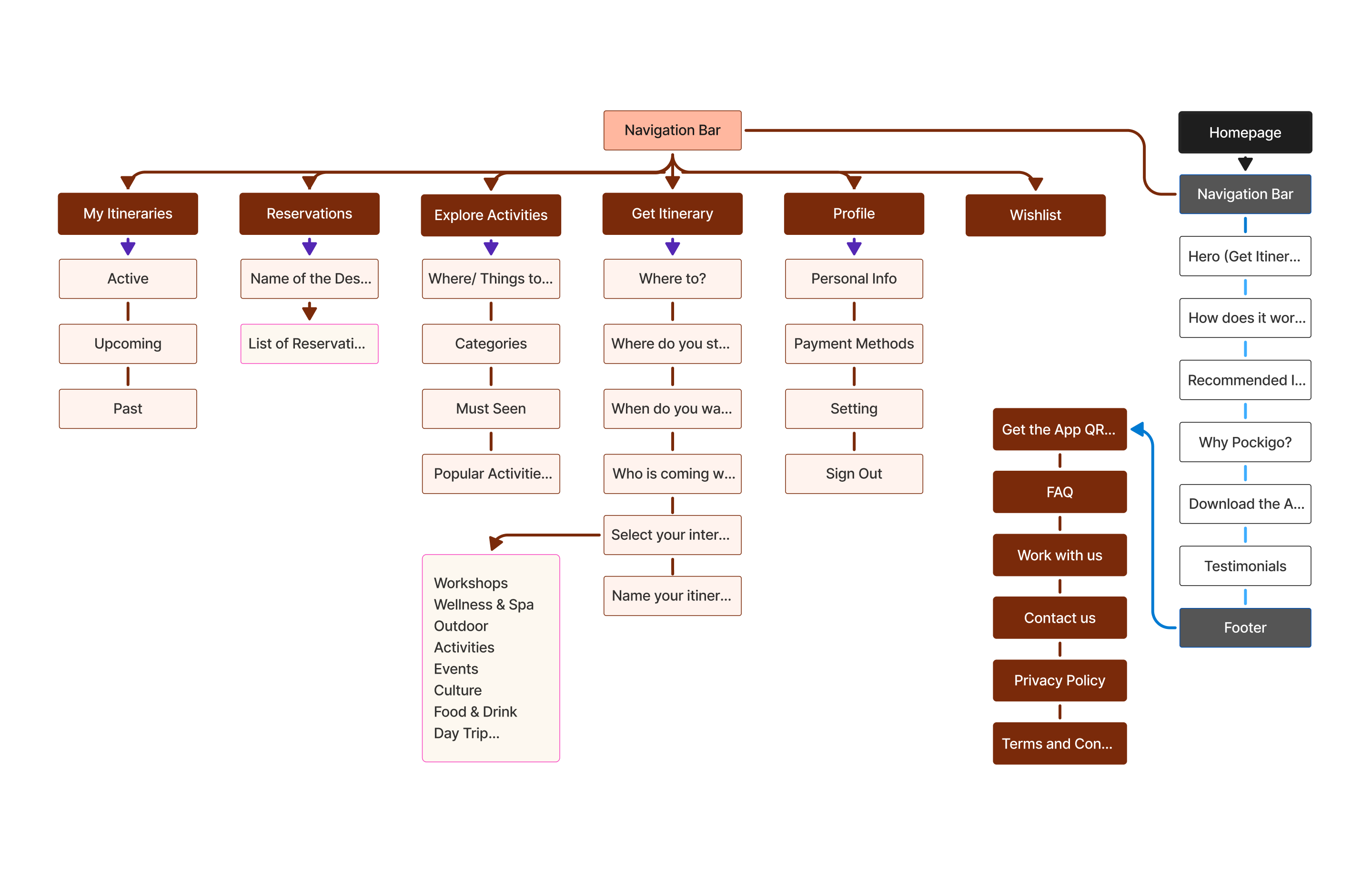
With the categories defined, we structured the full site map — outlining the page hierarchy and how users would navigate between discovery, planning, and their itinerary.
08 — Develop
With the structure defined, I moved into wireframing and visual exploration — testing early with users and establishing the design direction before high-fidelity work began.
Testing & Iterating
Wireframes were tested with participants across two rounds. Each screen below reflects changes made in response to what users struggled with.
Homepage
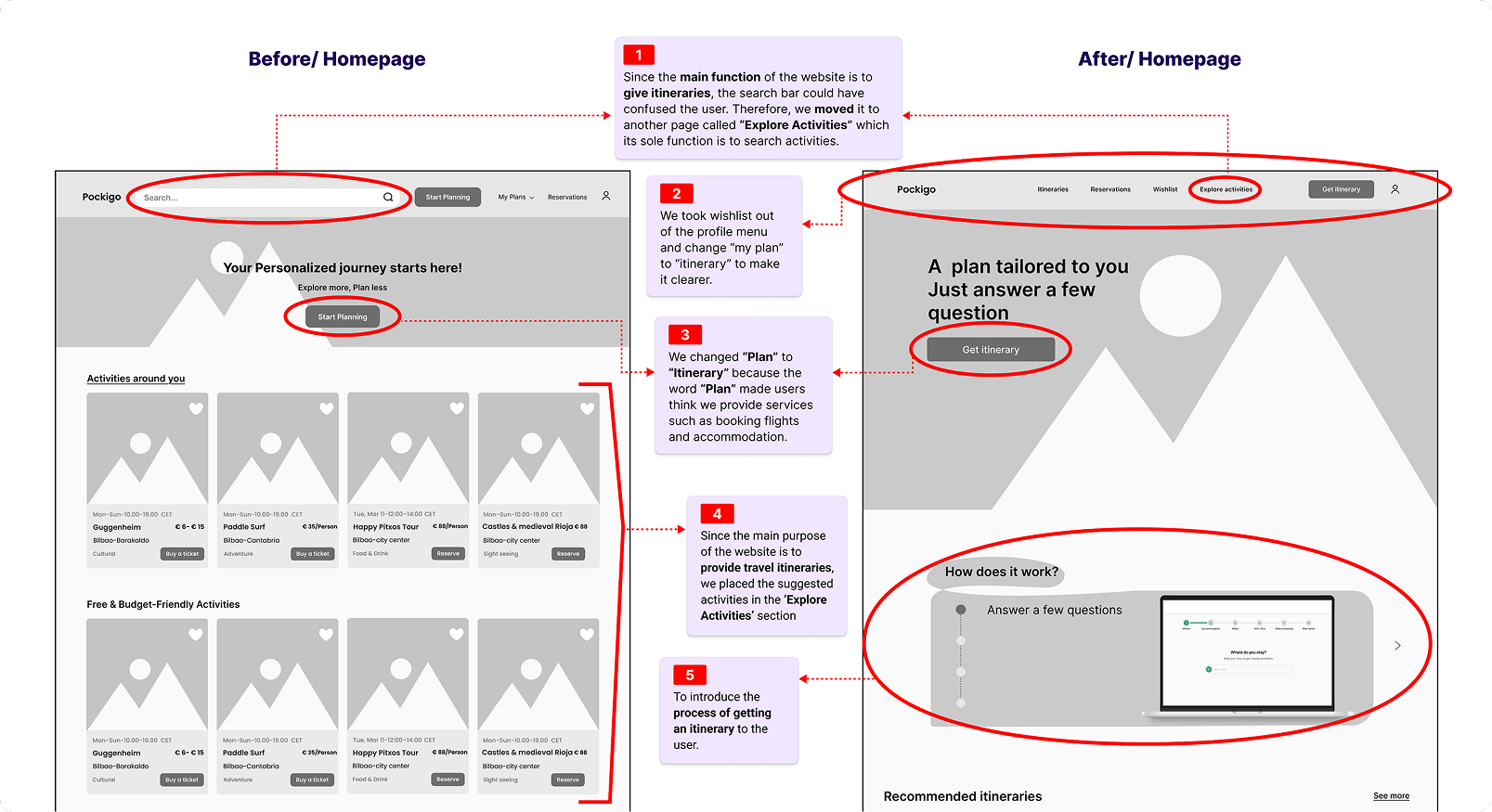
Moved the search bar to a dedicated "Explore Activities" page, renamed "Plan" to "Itinerary" for clarity, and introduced a "How does it work?" section to guide users through the process.
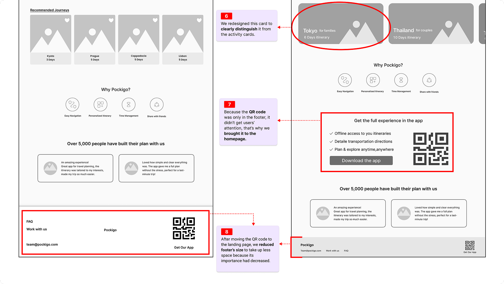
Homepage — Footer & QR
Redesigned the recommended journey cards for clarity, moved the QR code to a prominent "Get the full experience in the app" block, and reduced the footer to a clean, minimal strip.
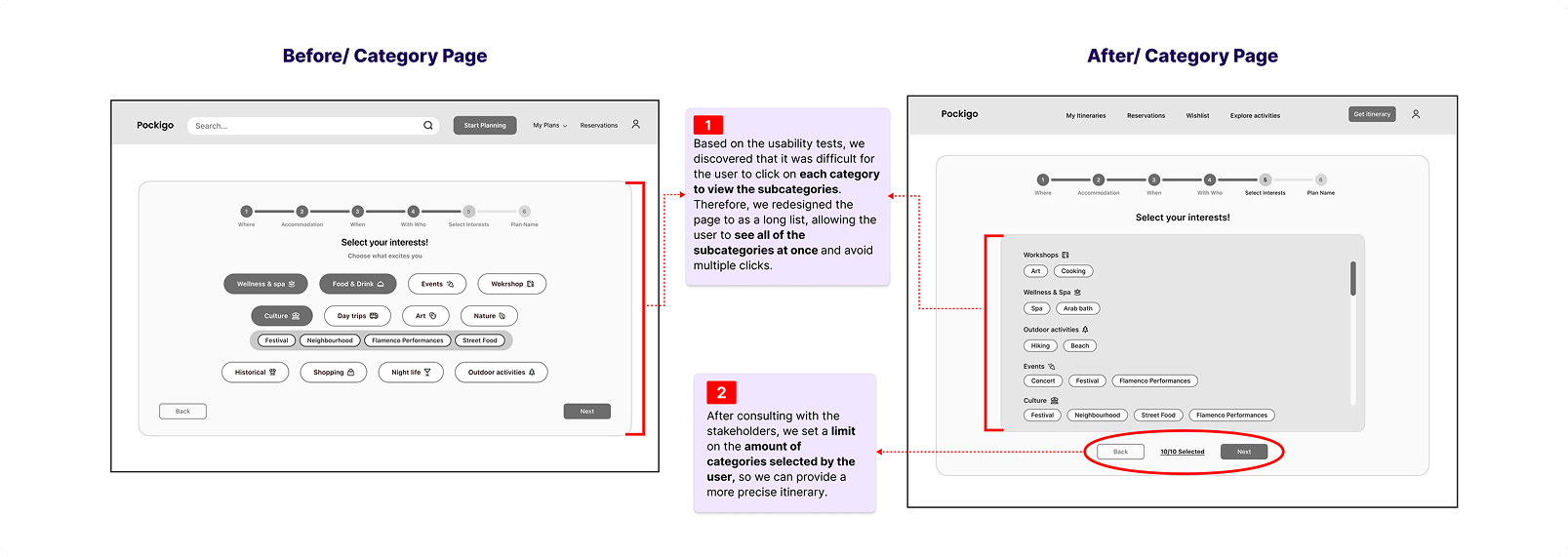
Category Page
Usability tests revealed that clicking into each category to see subcategories was frustrating. We redesigned it as a scrollable list showing all subcategories at once, and added a 10-item selection limit.
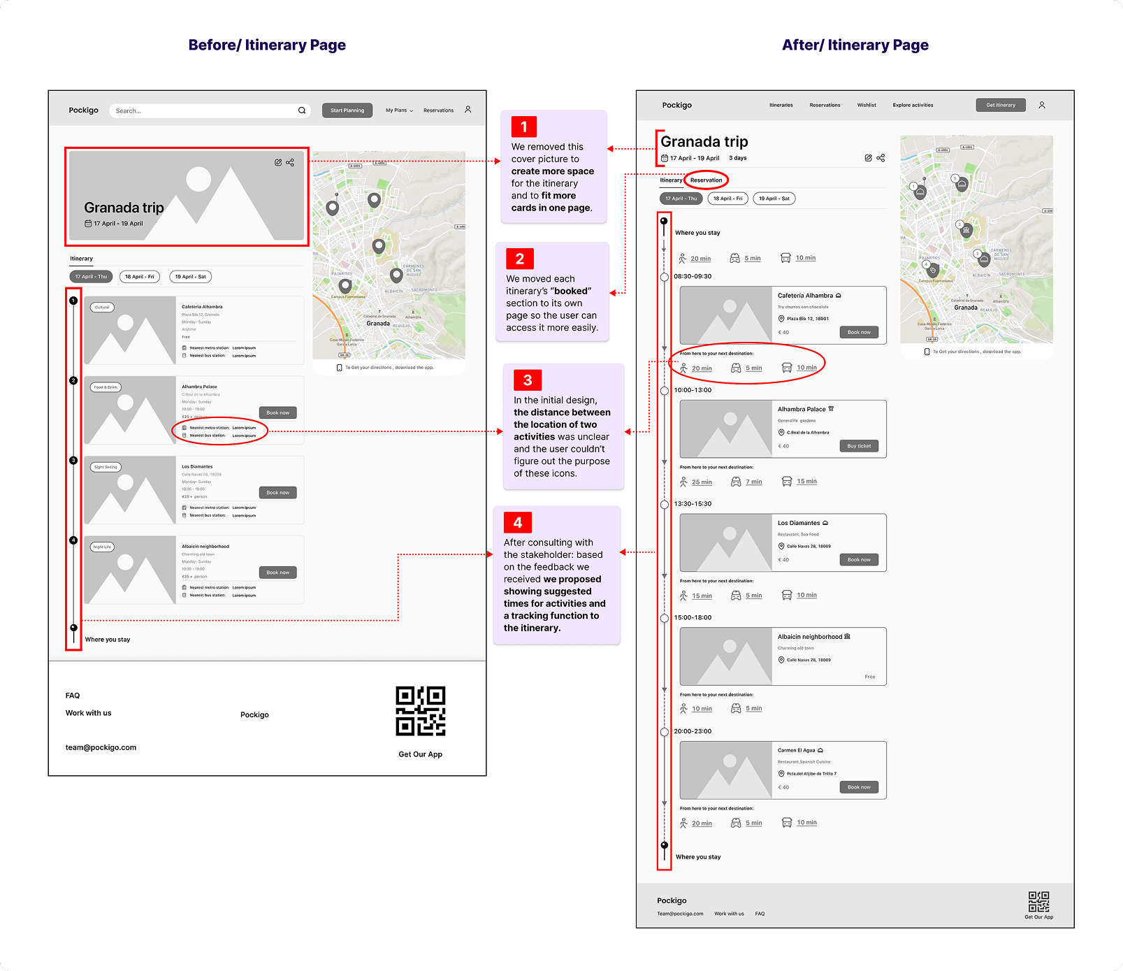
Itinerary Page
Removed the cover image to fit more content, split "Booked" into its own tab, replaced unclear metro/bus icons with travel-time indicators between activities, and proposed suggested times and tracking.
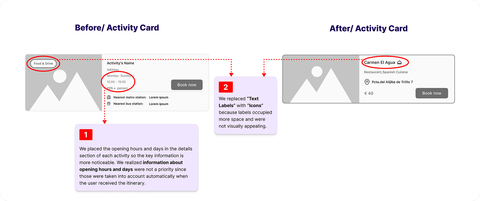
Activity Card
Moved opening hours to the activity details section and replaced text labels with icons — key information became more prominent while the card felt lighter and more scannable.
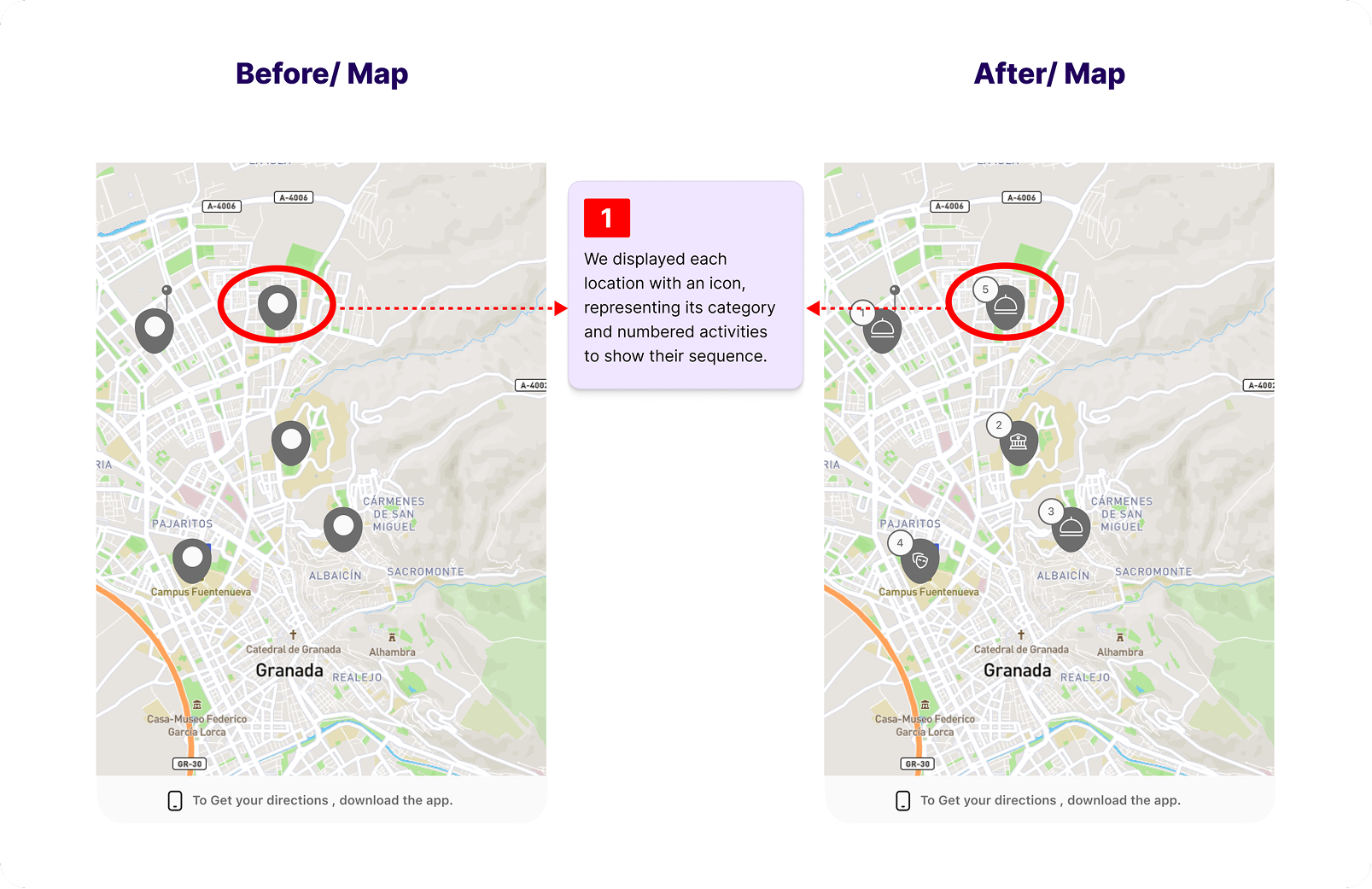
Map
Replaced generic pins with category-specific icons and added sequence numbers to each location, making it instantly clear what each stop is and the order in which to visit.
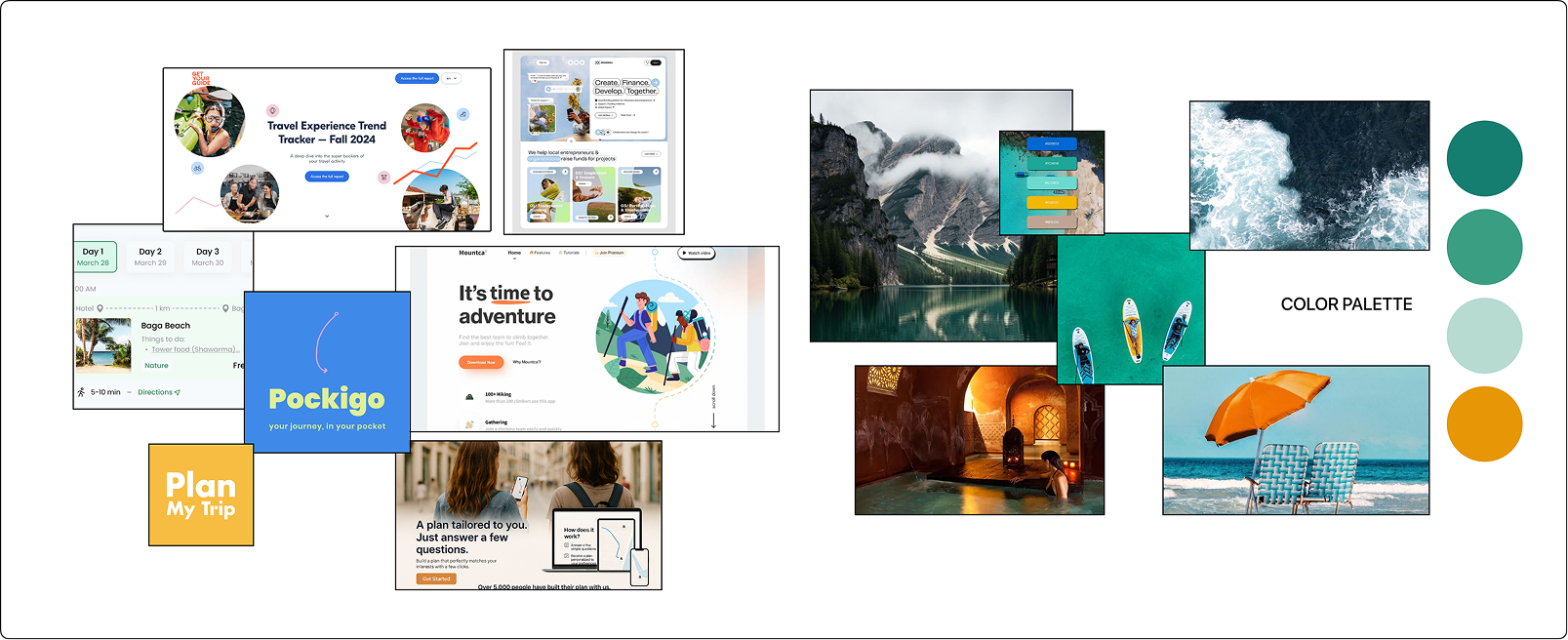
Moodboard
Before building the UI, we established the visual direction — tone, color, typography, and imagery style — to guide every decision that followed.
09 — Deliver
Four deliverables that brought everything together — a design system, high-fidelity screens, a final round of validation, and a clickable prototype.
UI Kit
Before designing the final screens, we built a UI kit — defining the component library, spacing rules, typography scale, and colour tokens that would keep every screen consistent.
Usability Test
We ran a final usability test on the high-fidelity prototype with 5 participants, validating the key flows and surfacing last-minute refinements before handoff.
Final Prototype
The final Figma prototype covers the full user journey — from landing page through destination discovery, activity selection, and itinerary management.
10 — Reflection
Eight weeks of designing for a space I personally love taught me as much about scoping as it did about UX.
What I learned
Planning tools fail travelers not because they lack features — but because they don't account for how messy and non-linear the planning process actually is. Designing for that messiness required resisting my instinct to tidy everything into a clean flow.
What I'd do differently
I'd scope the IA earlier and test it with a card sort before committing to navigation structure. The second round of wireframe testing revealed structural issues I could have caught two weeks sooner.
Sign-in timing: I'd reconsider when we ask users to sign in. Right now the gate appears immediately after the plan is generated, before the user has seen it. Showing a couple of stops first and gating the rest might work better, because the product gets a chance to prove itself before asking for an account.
What worked
Starting with real traveler interviews before sketching a single screen grounded every design decision in something observable. When trade-offs came up, I had a user to think with — not just design principles to apply.
Simplifying the planning flow: Moving from a 6-step wizard to a single form was the right call. Having everything on one screen, with a live preview updating as you fill it in, made the experience feel fast and honest about what the product actually does. Users can see the output forming before they commit to submitting.
More options, less signal: The V1 flow had 15 interest categories. In practice, most users selected 10 or more, which told us almost nothing about their preferences. Replacing the long list with just pace and a few top-level areas gave the generator something it could actually use. Simpler inputs, better output.
Next steps
The web product is solid, but the real use case for an itinerary is day-of, on your phone, while you're walking between stops. That's the next piece of work — and a separate case study.
"This is exactly what I wished existed when I planned my trip to Japan."
— Participant 5, usability test round 2